DAR iPad Application
An in-depth analysis for the iPad application for the three-part DAR Application, which helps facilitate and care for animals at the University of Illinois.
View Full Case Study
ROLE: Visual Design, User Experience Design, HTML, CSS, JavaScript, jQuery
CLIENT: Office of the Vice Chancellor for Research - University of Illinois at Urbana-Champaign
Within our department, The Office of the Vice Chancellor for Research, we ensure research personnel (students, faculty, and staff) follow government compliance when dealing with research. This includes ensuring all the personnel complete their required training.
For training administrators and our department, all compliance training was tracked using Excel spreadsheets, emails, or they would have to commit it to memory. Administrators didn't have any software or tools available to take their training.
Because the project was quickly developed, there wasn’t a chance to get feedback from training administrators or research personnel.
The way we had to approach this project was to look at common educational learning platforms, which was then used to develop the sitemap, create mock-ups of the training cards and administrator settings/reports page, and finalize the application’s design and sitemap.
I wanted to look at common educational learning platforms which solved these problems.
Below is a competitor analysis table of the online learning platforms competitors I analyzed: Coursea, Adobe Captivate Prime, and Treehouse.
| Analyzed Criteria | Learning Platform Competitors | ||
|---|---|---|---|
 |
 |
 |
|
| Sitemap | Good divide between teacher and student accounts | Students, not as easy to find specific training | Navigation mainly of breakouts for types of training |
| Website Layout | Easy to distinguish sections and find items needed | Minimal and easy to distinguish sections | Simple navigation and content structure |
| Training Cards | Too big for little information in the cards | Simplistic, compact with only important information | Professional, detailed, compact cards |
Adobe Captivate Prime
Keynotes
“Little information to display but takes up a lot of screen room"
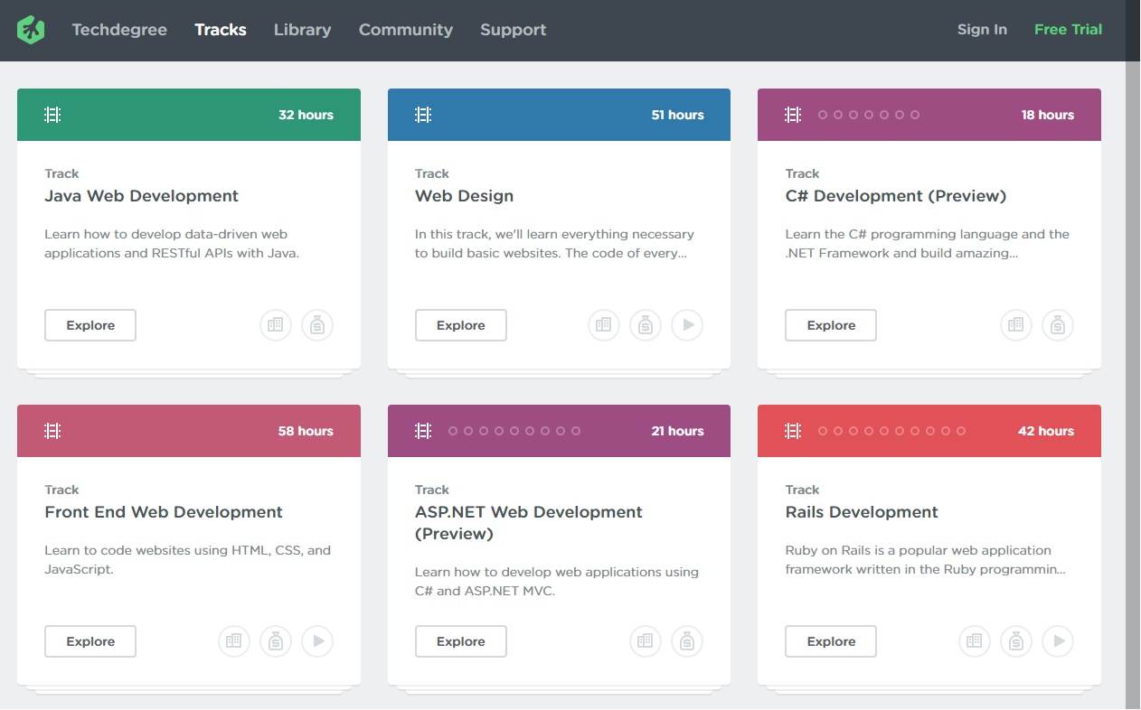
Coursea
Keynotes
“Compacts the training information into a nicely organized, small space"

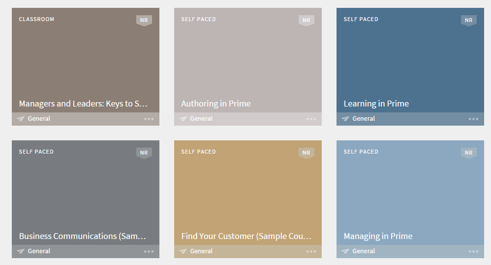
Treehouse
Keynotes
“Perfect-sized training cards which makes the training fun while being professional"
But, lots of information needed to be incorporated to our training “card”. Treehouse has a better organization for what our stakeholders wanted to display on the site. The other cards seemed to have little information and didn’t utilize the space properly.
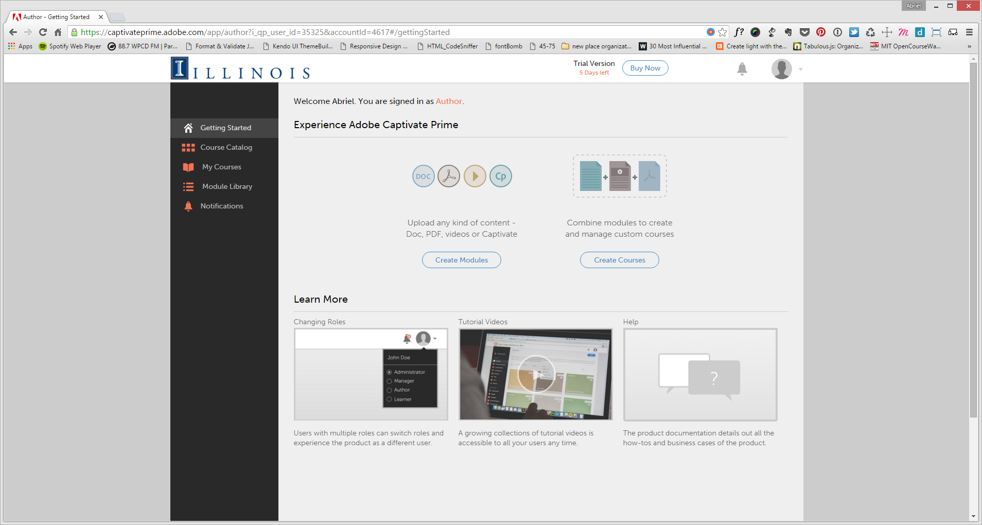
The only administrative section I was able to view is on Adobe Captivate Prime site. The Prime site has separate websites for the administrative and student users.
Administrative section of Adobe Prime Captivate
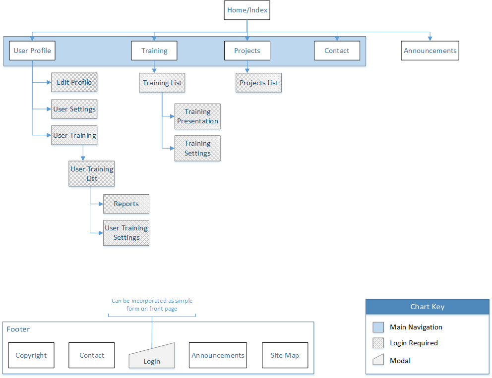
Our stakeholders wanted one location where they could manage the researchers or students who needed to take a specified training set.
As a result, the initial site map developed into the following:
Initial training system site map
Now that we’ve put together the site map, we are now flushing out the UI. Our team was debating:
The most important information the site needed to convey was when or if the training was set to expire and if the training was required. Here are three different approaches:
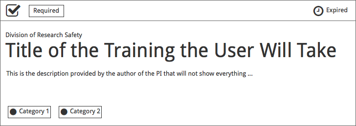
Mockup 1
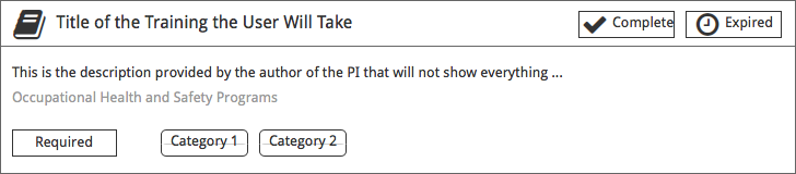
In the top section of the training card had three distinct sections: whether the training was complete by the user, the training is required for the user, and the training’s expiration date.
The middle section shows the author of the training above the training title with the training description below.
The categories are shown at the bottom-left section contained in a triangle and a black dot to represent the color of the particular category.
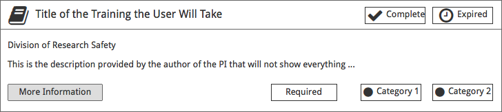
Mockup 2 & 3
These two mockups are very similar, but have their differences. The top section of both mockups 2 and 3 (top and bottom, respectively) contain the following: an icon to the top-right of the training to designate the training category, the training title, the training’s completion status, and the training’s expiration date.
The main difference between mockups 2 and 3 is the placement of main elements within the main section of each card. Mockup 2 places the training author and description on top, then shifting the training required status and categories to the bottom-right. While in mockup 3 switches the order of the training author and description, shifting the training required status and categories to the bottom-left.
To note, in mockup 2 a “More Information” button at the bottom-left to designate the section as an area the user can click to get more information about the training.
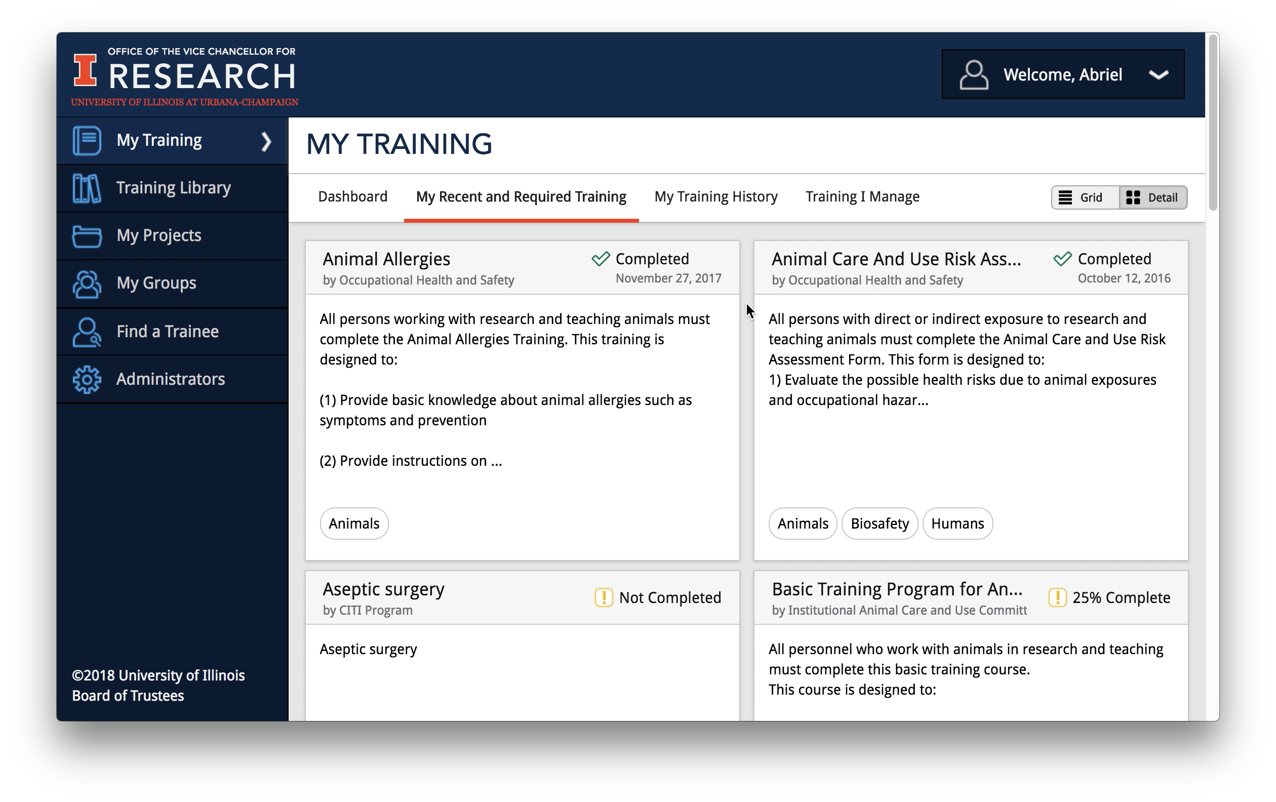
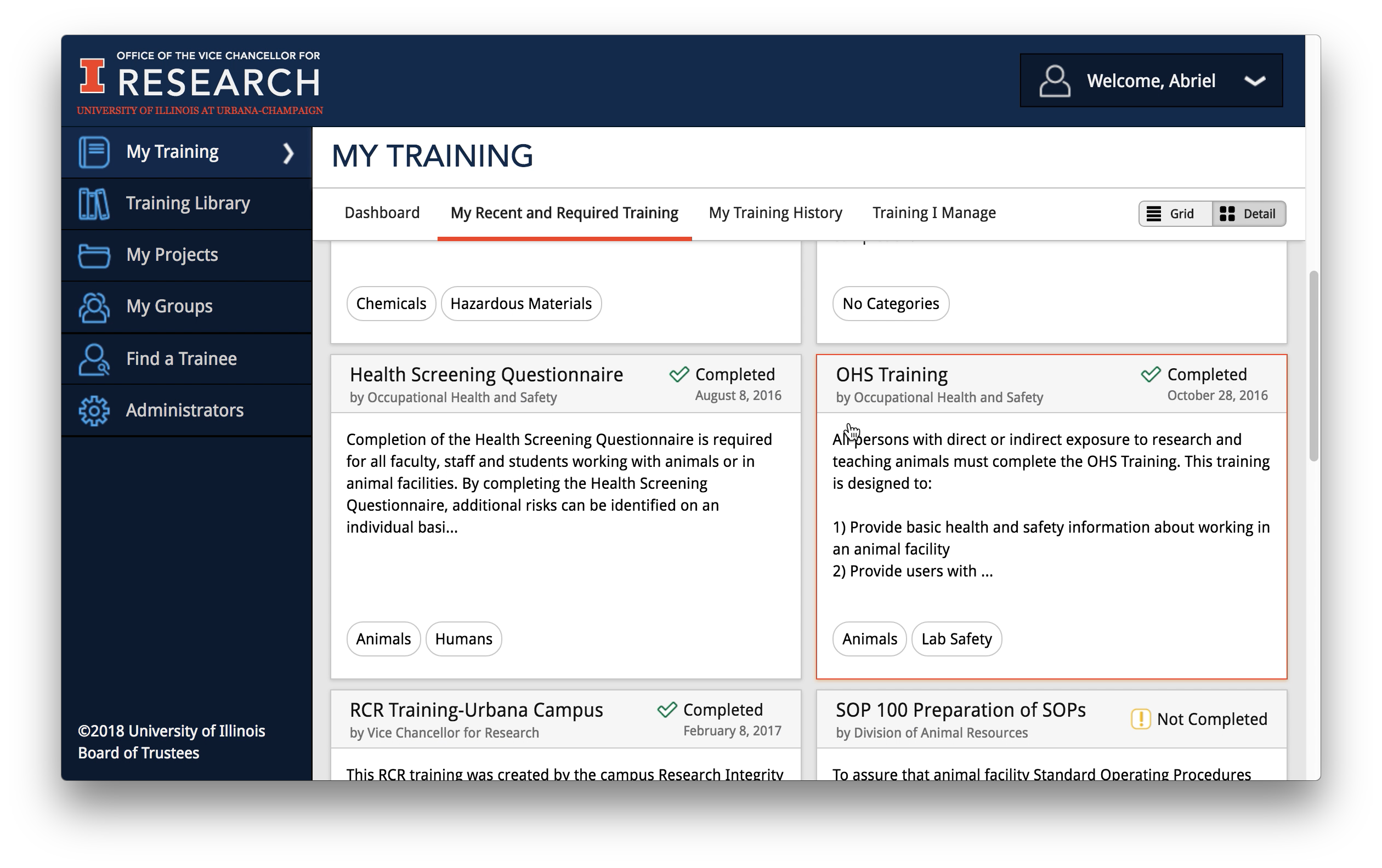
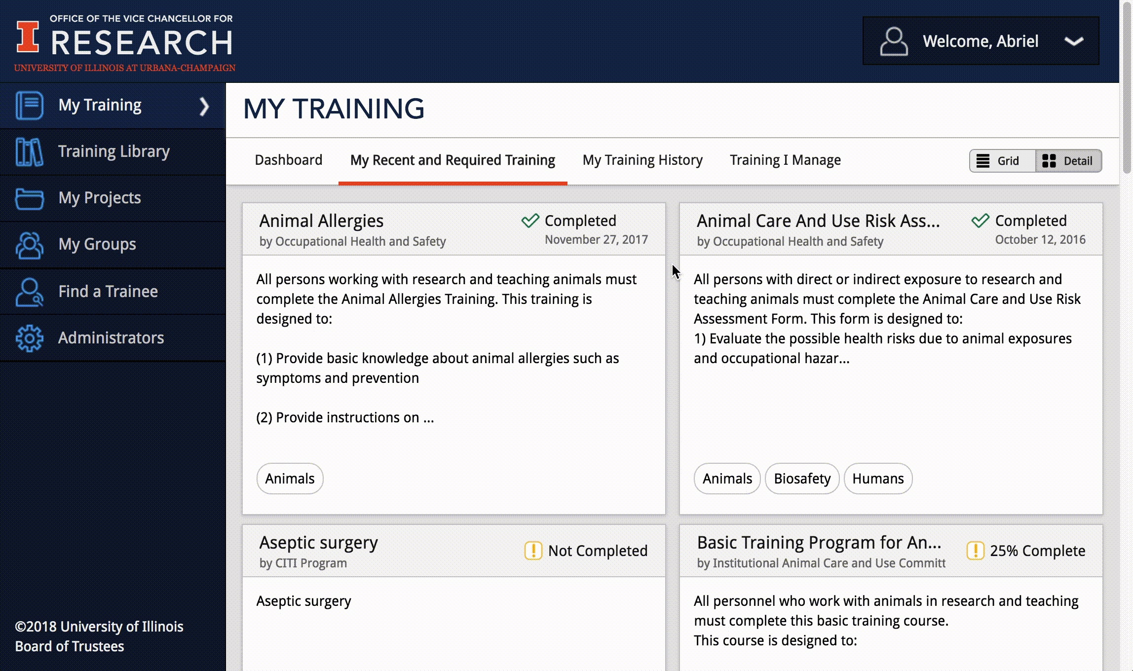
Icons and statuses were made for each of these. Because of the amount of information shown, the the team decided to have required training status be a part of the sub-navigation for the user's Training Page. The tabs were called "My Recent/Required Training" and "My Completed Training".
The rest of the information is displayed like in the third mock-up, with the following as set statuses: "Expired", "Expiring Soon", "Completed", "Not Completed" or "Completed __%" - depending on if it was a multi-part training.
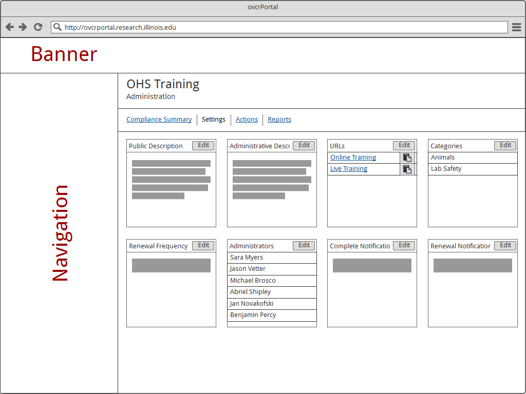
Initially, we were trying to keep all of the settings on one page for everyone to configure. Because of the complexity of the trainings and how much control administrators wanted to have, lots of settings were created for each type.
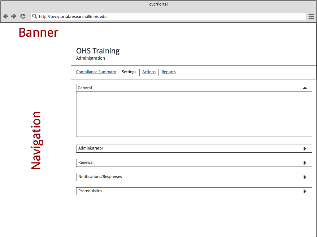
I wanted to try and have it look similar to the training cards to ensure style consistency and scroll-time on the page. It was thought instead of trying to copy the training card style, it might be easier to preface on the main training site using an expansion tool which expands and collapses settings within a card.
Training card style training settings mockup
Expand/collapse training settings mockup
We decided the end result was each setting within the display would have it’s own line on the page. This was due to the load time and engineering it would take to configure this into the page. Designated to the right of the setting label would be an edit button to have a modal open to edit the settings.
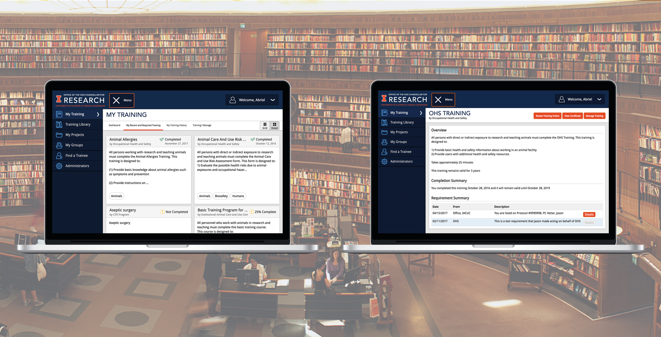
The final website layout of the compliance training system
Training card highlighted with outline at hover
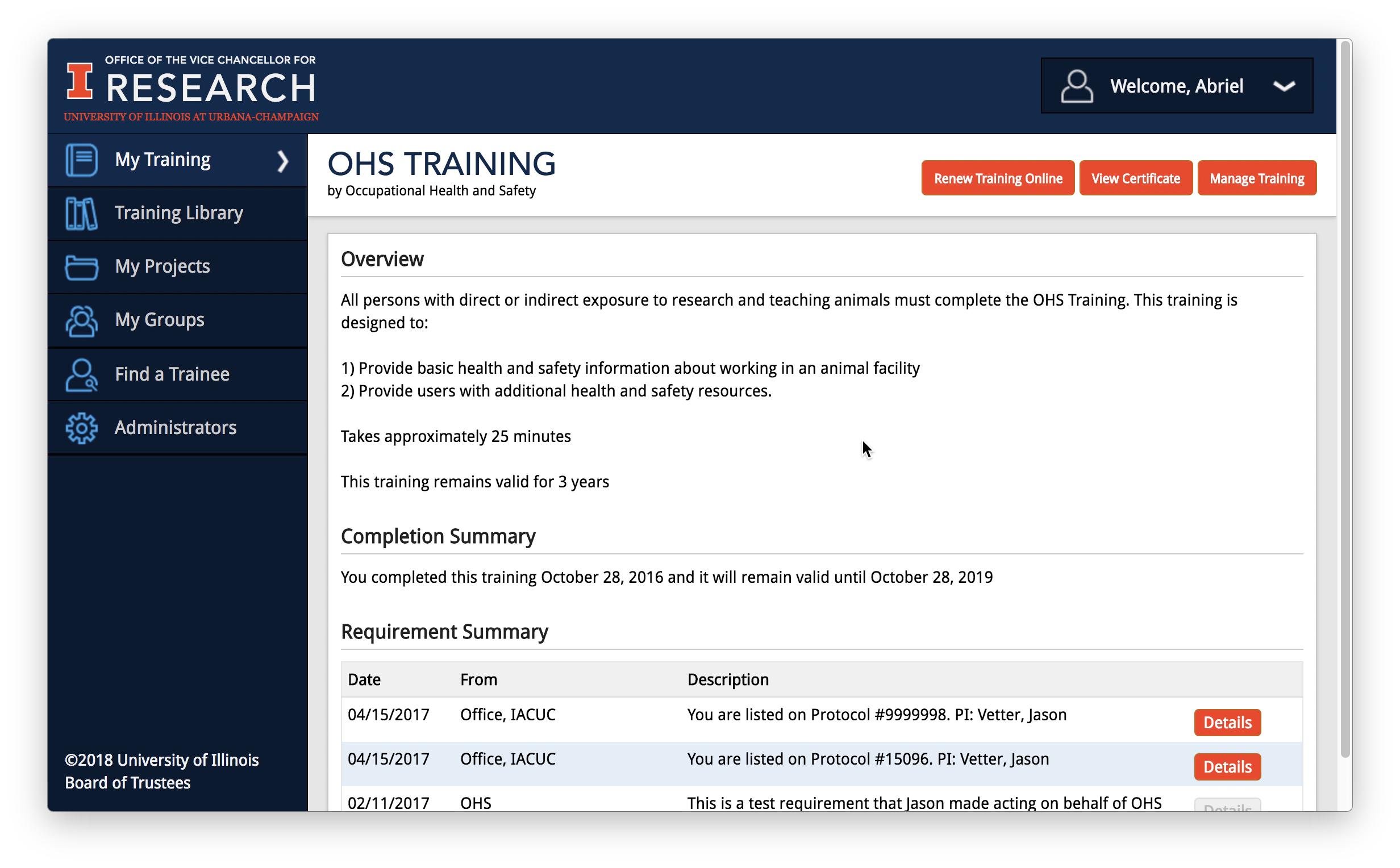
The final training page layout
We shipped out updates for our product. It was exciting to get the following feedback about our product:
“I am writing to tell you how much I appreciate the recent improvements to the research compliance websites. I am offering a new, year-long, research elective for the DVM students and yesterday was our discussion on research compliance. Over the weekend, I intended to update my previous lectures on the various topics and looked at the OVCR website to see what I could use. To my complete delight, everything is there! The improvements are much appreciated and very helpful. I can see the hours of effort spent to build the various pages and know that many people will benefit from the result.”
Additional features currently being investigated or implementing in the system include:
© 2018, Board of Trustees at the University of Illinois. All rights reserved.